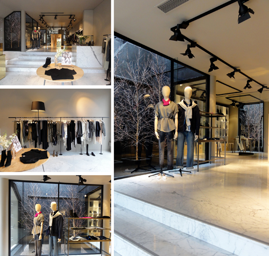
 Love the black wall light well with a twiggy botanical bent that is reflected in the rear wall mirror at Acne's newest Melbourne mecca for cool. They've set up shop in the designer strip that includes Aesop, Leigh Mathews, Scanlon & Theodore, Arabella Ramsay and the new Megan Park store on High St Shmarmadale (err... that would be Armadale).
Acne + Armadale + Arborist = Attention
Park yourself here
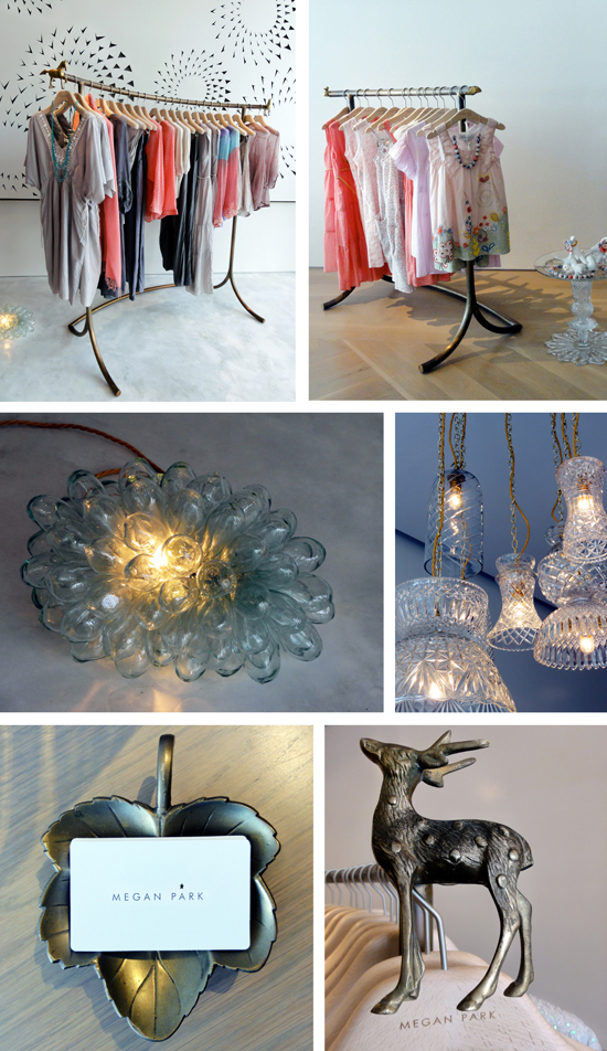 Megan Park has just opened her first stand-alone store in Melbourne. Subtle, beautiful attention to design detail is the backdrop for her gorgeous beaded chiffons and summer must be on the way silky sheer numbers. Layers of chalky white tones and textures, elegant illuminated cut crystal and quirky brass animals by Suzie Stanford, and delicate paper artwork by Geoffrey Nees has been curated by Megan's partner Anthony Cox, a delightful English architect who kindly gave me a tour of this tour de fashion force. His clever extension of the main floor plate by floating it over the existing steps and using the counter to connect the levels, combined with the chalkiest white concrete entry floor and a delicate sheer curtain drop to ensure discretion in the change rooms shows his thinking is thorough when it comes to the girl about town shopping experience. You can find Megan Park at 1039 High Street Dramadale... opps, I mean Armadale.
A shining light in Lebanon
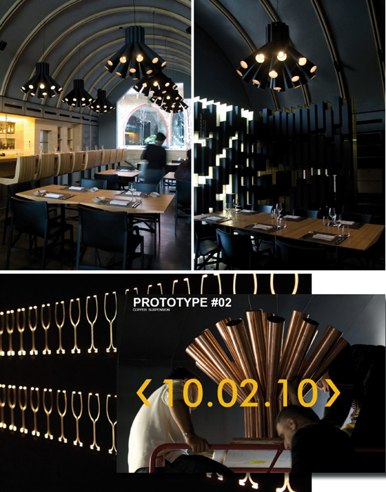 PSLAB is a lighting design company in Lebanon with an impressive portfolio of projects. Burgundy restaurant in Beirut is all the better for their striking arrangement of bulbs.
London calling
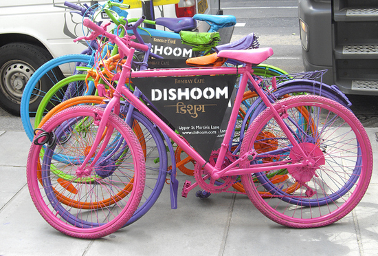 Only 4 weeks until I head off for the PODs annual ERA (Euro Retail Adventure). Doing lots of late night research and lining up interviews... which lead me to discover these bold coloured bicycles promoting a new Bombay inspired cafe. Fab looking web site. I hope the food tastes as good as the photos promise. Via flickr
Drawing attention
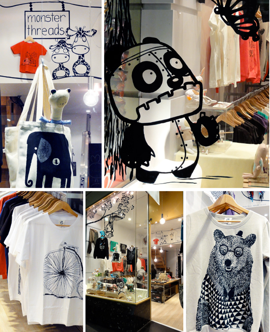 We all know lux levels are critical in retail land. This afternoon I saw the light... and some v. cute illustrations. Being a big snoop and a bit of a 'Harry have a chat', I bowled into Monster Threads to discover it was only day 5 since they opened the door and the concept is a collective of product from illustrators around the globe. I like that idea (and that bear wearing the glasses, bow tie and mini bowler hat). Curated collections based on arts & craft hit the sweet spot in retail land these days. Bland brands beware.
Budget b&w window
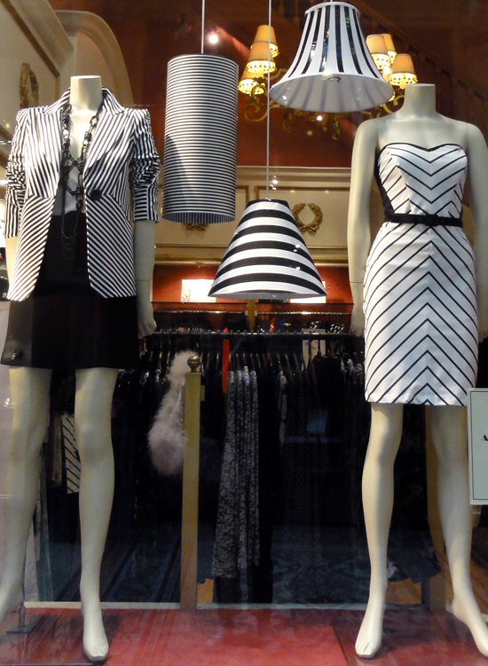 My guess is you cover 3 old light shade frames found in an op shop for 50c a piece... next minute you know bob's yer uncle, mary's your aunt and voila you have a low budget VM solution. It caught my eye so as far as I'm concerned it's working.
California dreamin’
 My American BFF lives in San Diego. She reports this is the hottest spot in town. Am loving the relaxed look of chef Brian Malarkey's new restaurant, Searsucker. Pics via Chantelle Photography.
Finding their way
 When I was a kid we would go on an annual family holiday by car (OMG can you imagine driving from Melbourne to Maroochydore with 5 kids in the back seat of a sedan during a stinking hot summer in the days when air con meant winding the window down?!). My job was 'chief map reader' as Mum was 'geographically challenged' (or probably delirious at the entire prospect of a 'holiday').
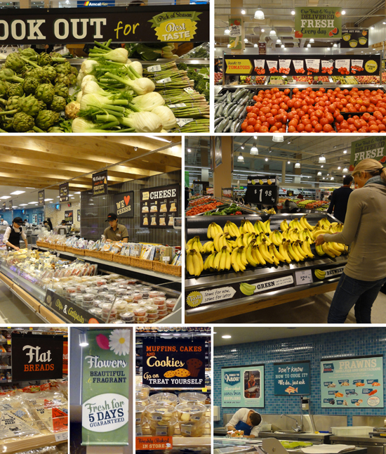
Last August I reported on the new look Coles rolled out in Claremont Quarter, Perth. At the time the design was certainly going in the right direction but the detailed way-finding and brand elements were missing... they seem to have consulted a good brand map since then.
Just last Thursday Coles rolled out a significantly more developed concept in Tooronga. Signposting has improved dramatically and there is lots of helpful information, particularly in the fresh produce department. The staff spruiking the seasonal specials didn't sound scripted (now that is an achievement outside our traditional fresh produce markets). The graphic look is friendly, the content helpful (seasonal and usage based) and quality guarantees are thrown in for good measure. My first thought was that the visual communication might be inspired by the Jamie Oliver magazine? Whilst driving on price is the Coles direction, the freshness and quality message was strong. Value was being delivered left right and centre (a 6 pack of scotch filet steaks for $10!! and as an opening special shoppers received 10% off for spending over $100). Given we are in footy finals season, I would say that from a brand shift perspective Coles has taken a specky and then kicked a pretty decent goal. ps. soz about the pics - my snoop snaps are not the best.
This DJ spins a familiar tune
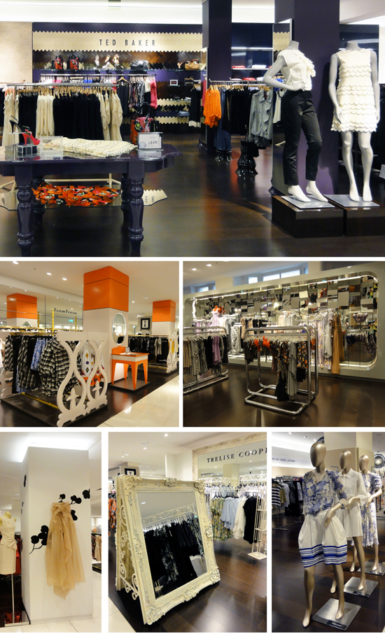 Megan Gale cut the ribbon for the re-opening of David Jones' Melbourne flagship store today. I have to say I struggled to find the WOW factor. VM stories and in-store moments didn't really make me go 'oooh' or 'I'm lovin' that' (and I love a bit of oooh and VM love in retail land). Concession fit outs that did catch my eye included Ted Baker, Zimmerman, Easton Pearson and Trelise Cooper. For a brand that has suffered a few hiccups over the past few weeks my remedy rescue is to take a leaf out of Liberty of London's VM manual and a couple of Anthropologie in-store moment pep up pills to help overcome their PR woes. Their annual spring flower extravaganza is always bloomin' fabulous so we know they can do it.
Plant a seed, watch it grow
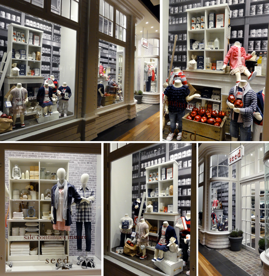 Seed windows at Melbourne Central are a lesson in precision.
