POD has a new look Facebook page. Like it to keep in touch with blog udpates.
www.facebook.com/POD.PointofDifference

POD has a new look Facebook page. Like it to keep in touch with blog udpates.
www.facebook.com/POD.PointofDifference
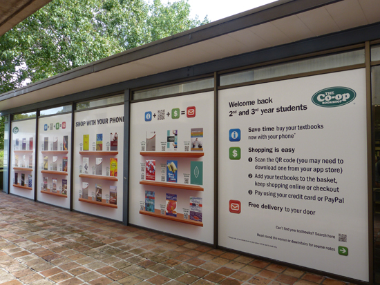 University of the Sunshine Coast is talking their students language.
 POD peeps pulled an all-nighter at Highpoint (Melbourne) to deliver fashion activations and some seriously long hoarding treatments for the launch of the GPT development this morning. Running with the 'Life in Colour' theme, POD picked up on the vibrant campaign developed by the tres talented Paper Stone Scissors and got to work with our creative crayons and over sized paint brushes. Here are some behind the scenes snaps, taken at various stages over the past 48 hours, plus a very happy looking Mardi Ashkine (Regional Marketing Manager for GPT & our savvy, stylish client) with the lovely Carrie Bickmore who MC'd this mornings launch activities. If you're out West today or tomorrow, pull up a pop coloured chair and check out the lastest runway fashion from new retailers including Top Shop, Miss Selfridges and David Jones. Amazing job by my production team - thank you all. If you like what we've done, click Like below! (Professional pics will be shared soon).

My BFFs from Perth are current skiing in Vail. I wonder if they have seen anything as cool as this on the slopes? Since 2004 Simon Beck has been stamping his mark on freshly fallen snow at the Les Arcs ski resort in France. Distinctly geometric pattern are created footprint by footprint. Taking somewhere between six hours and two days to complete, his endurance comes from years of competitive orienteering which also helps him in the precise mapping process which often begins on a computer before he’s able to mark landmarks in the snow that guide his precise walking patterns.
To see more of Simon's tres cool snow art check out www.facebook.com/snowart8848

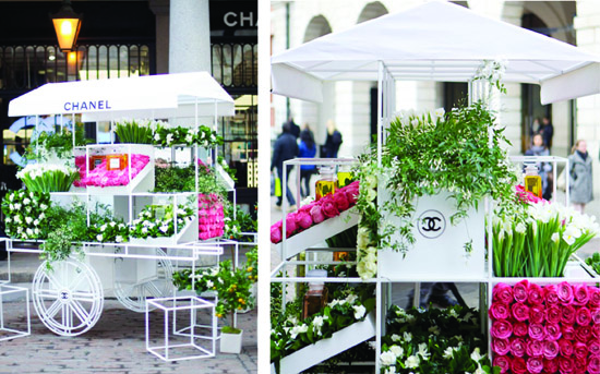
Chanel beauty stores appear to be making in roads into Australian suburbs. Opening this Thursday at Westfield Carindale (Brisbane), at the new look Highpoint (Melbourne) next week, and already well established at the likes of Chadstone and Westfield Bondi Junction, if you can't afford the fashion you can certainly pop a lippy and nail polish in your purse without breaking the bank. In July 2012, CHANEL launched a unique pop-up beauty boutique in the heart of London’s Covent Garden. In 2013, now a permanent resident, CHANEL celebrates their new perfumery through the scent of flowers (seemingly the perfect location if you recall Audrey Hepburn as the flower seller, Eliza Doolittle, in My Fair Lady).
The Brits celebrate Mothers Day in March (down here in Oz we do it in May). If you happen to be in London next weekend, from Friday 8th March to Sunday 10th March, the CHANEL flower stall will be selling bouquets of blooms used in the House’s most celebrated fragrances. A hand written message by a calligrapher on a Camellia embossed card, with a choice of quotes from Mademoiselle Chanel, as part of the deal. Very nice indeed. via www.telegraph.co.uk

Mid way through last year the owners of a 'run of the mill' cafe in Kew decided they wanted to 'get a bit groovy' and appeal to a more urban bod / 'Yummy Mummy' type living in this well-heeled leafy suburb. Some good advice from a regular coffee client (an architect) was ... "engage a good interior designer and work with what you've got". Comer & King got the gig along with very modest budget (nothing new there, but in this case spent with maximum effect ... which is why you call in the expert in the first instance isn't it? ).
Once a new name, brand identity and colour palette was established and the interior concept agreed the C&K team got busy. A couple of dodgey old doors were replaced bright blue new ones (hard to miss as you are driving down High Street and the owner's loved the idea ... "we thought it was brilliant - we really stand out on the street now"). Freshly painted tones of steel blue, charcoal and taupe gave the dining spaces definition. A side board was painted and relocated. Popular pop blue Tolix chairs, new tables, some fab light fittings, an oversized clock, a collection of plates with friendly food motives (hand drawn by Cameron Comer) and a bicycle bolted to the wall completed the transformation. Seating was reconfigured to provide 20 more seats (70 in total).
The owners are delighted with the results, both aesthetically and from a customer perspective (they are voting with their feet and wallets ... which was the intended outcome of the exercise). Without wanting to appear too nosey about their business, I understand they are now grinding through a lot more kilos of coffee each week and a strong Saturday trade has been established (a poor trading day before the make over) (FYI there were also line ups out the door and down the foot path in the first few weeks after re-opening which has now settled into a solid, sensible pace!)
Initially regulars thought the cafe was under new management. They soon figured out it was the same owners and same chef serving up their familiar favourites. Within a week or two word had got around and they were back ... along with a whole swag of new customers who had not considered it an option previously. I do love the pulling power of good design. Done well, it makes a big difference to the bottom line. Nice work by Comer & King who did both the branding and interior.
Fat Penguin, 713 High Street, Kew East, Melbourne.
To see more gorgeous interiors work go to www.comerandking.com
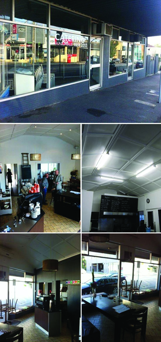
And for a peek at what it looked like before the make over ...
