Made in Manhattan

POD_twohands nyc4POD_twohands nyc8POD_twohands nyc6POD_twohands nyc3POD_twohands nyc5POD_twohands nyc2POD_twohands nyc7POD_twohands nyc1

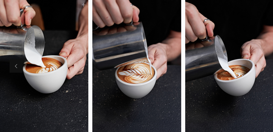
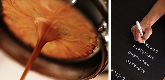
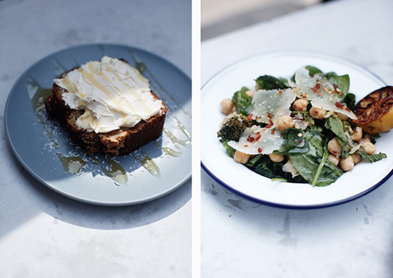
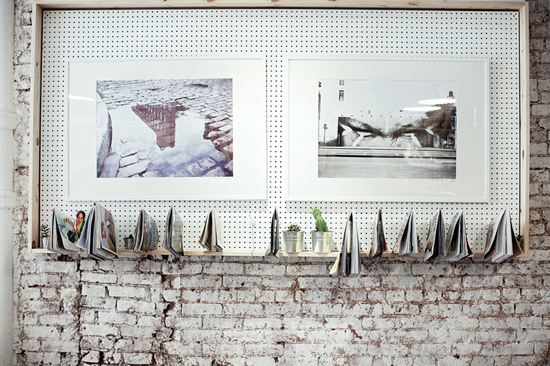
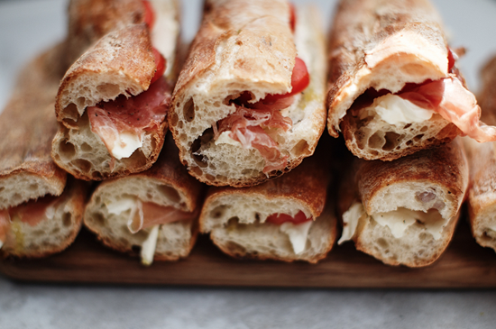
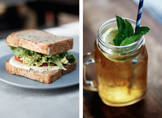
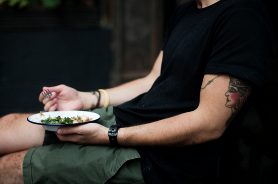
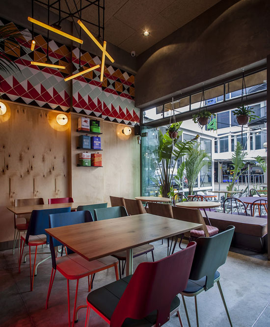
I'm researching for a trip to NYC and USA later this year.  Pleased to report that a couple of Sydney lads, Giles Russell and Henry Roberts, are making their mark in Manhattan and bringing that relaxed Australian cafe style, and good coffee, to the city that never sleeps. Love the look of Two Hands (it's definitely on the list). These gorgeous images are by photographer Josephine Rozman and sourced via www.twohands.com  

Two Hands, 164 Mott Street, NYC, New York.

#PODfinds

Two Hands Food New York
27/04/2015

A Mighty Fine Line

POD_buff diss tape artist01POD_buff diss tape artist04POD_buff diss tape artist05POD_buff diss tape artist09POD_buff diss tape artist08POD_buff diss tape artist02POD_buff diss tape artist10POD_buff diss tape artist12POD_buff diss tape artist11

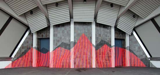
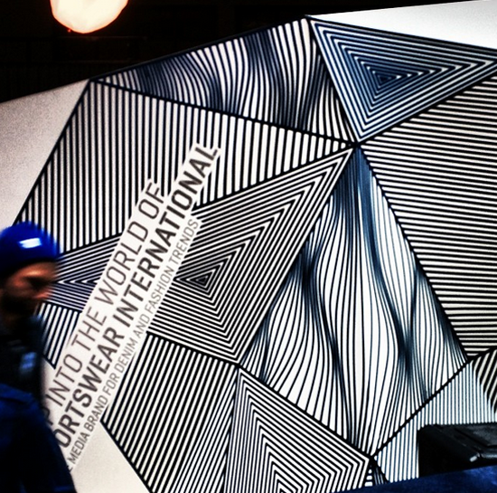
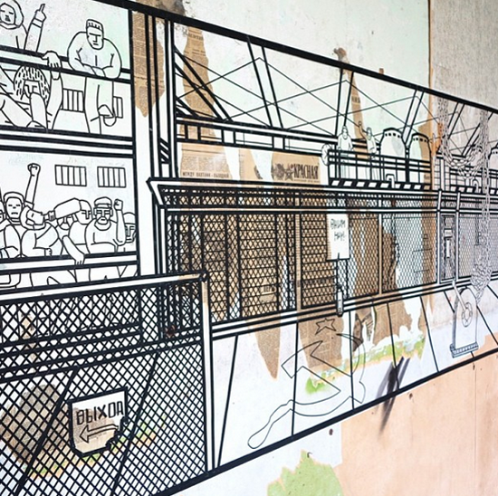
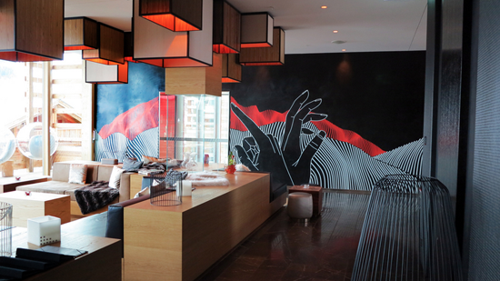
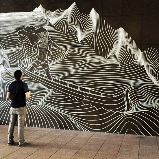
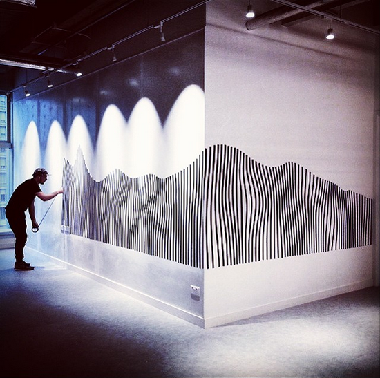
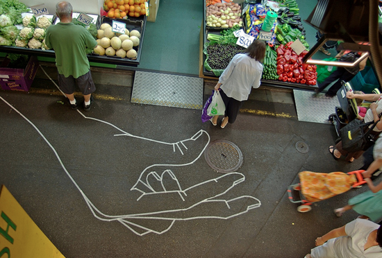
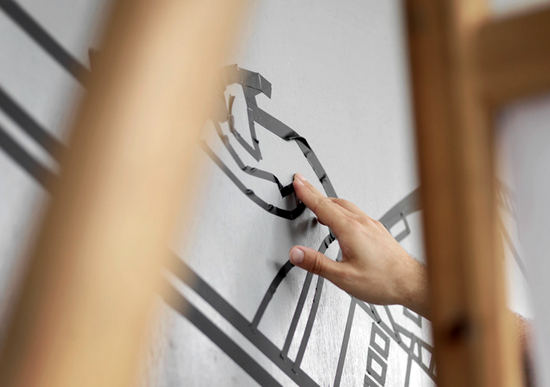
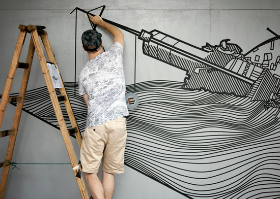
Buff Diss is a Melbourne artist who chooses tape as his medium. He has a seriously impressive folio of works from around the world (Hong Kong, Taipai, Berlin and beyond). Wouldn't I love to find a wall or two somewhere on one of my projects for him to work on!  All images via www.buffdiss.com 

Buff Diss Design
26/04/2015

A Tiny Indulgence

Screenshot 2015-04-26 13.25.57Screenshot 2015-04-26 13.25.33Screenshot 2015-04-26 13.23.30Screenshot 2015-04-26 13.20.32

I have to confess to a foodie instagram addiction. I love these cute sugar cookies from a baker called Samantha who lives in Toronto. Simple designs that are  instantly appealing.  @elleventy  pictures via www.instagram.com/elleventy

Design Food Toronto
26/04/2015

A Pop of Pink in Pamplona

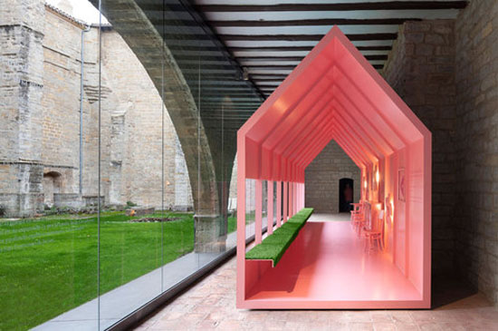
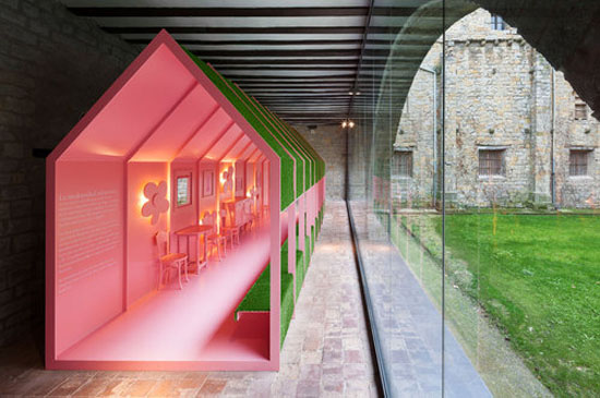
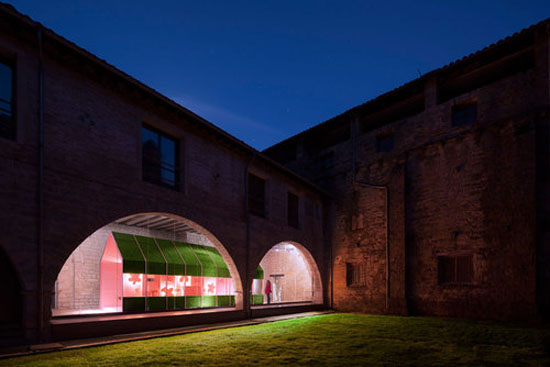
OCCIDENS-RPB-46_largeOCCIDENS-RPB-49_largeOCCIDENS-RPB-50_large This colourful conclusion to a continuous metal path that runs through the Occidens Museum, housed in the Cathedral of Santa Maria in Pamplona, is certainly unexpected. It makes me want to find out more ... what is the back story to this pink pitched roof structure, and what purpose does it serve?

I like the contrast to the ancient cloisters and connection through greenery, of old to new.  Visually, it stands out.

Standing out is something we in the retail sphere aspire to with every new store design.

Images via architects, Vailloir & Igaray.  

www.vailloirigaray.com/portfolio/occidens-museum

#PODfinds

Design Pamplona
19/04/2015

Super Souper

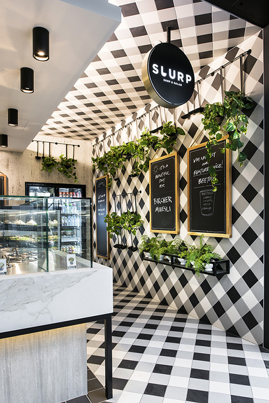
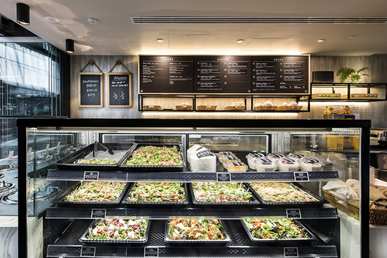
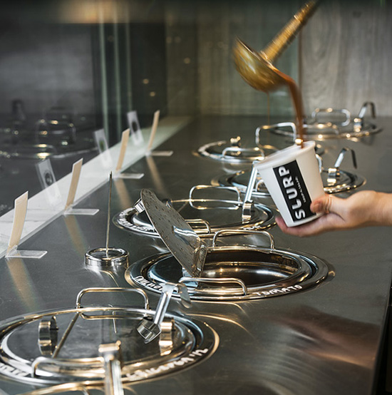
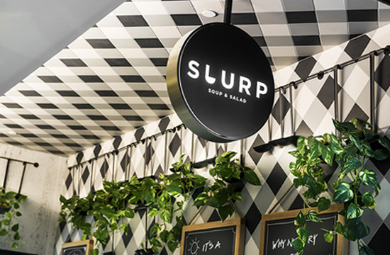
Slurp004_WebSlurp008_WebSlurp005_WebSlurp007_WebSlurp003_WebSlurp006_WebSlurp001_Web

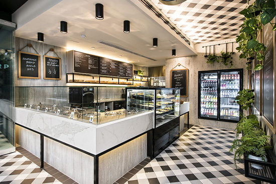
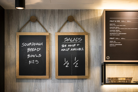
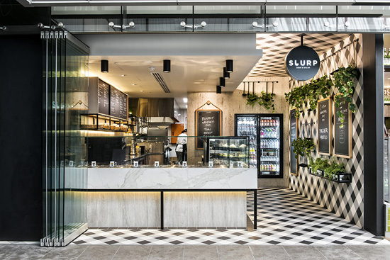
I love the striking simplicity of this mostly black and white palette. Mata Design based in Perth has created an eye catching space with the bulk of the design drama (that would be the tile pattern) being in what I would call the secondary space.

The main game of the business is, of course, the food offer. From what I can see this is off set nicely through the use of quality, neutral materials which really lets the food do the talking. Supported by a neat graphics package, if you had asked me what I thought of a soup concept with the name Slurp before seeing these images I am fairly sure I would have turned up my nose at the name, which just goes to show you how good design can reposition thinking!

www.matadesign.com.au  17 Brewer Street Perth WA 6000

Slurp Soup & Salad, Cloisters Arcade, Perth, WA.

Images with thanks via www.matadesign.com.au

#PODfinds

Slurp Food Perth
19/04/2015

More apples …

pod_7apples_gelatoSONY DSC

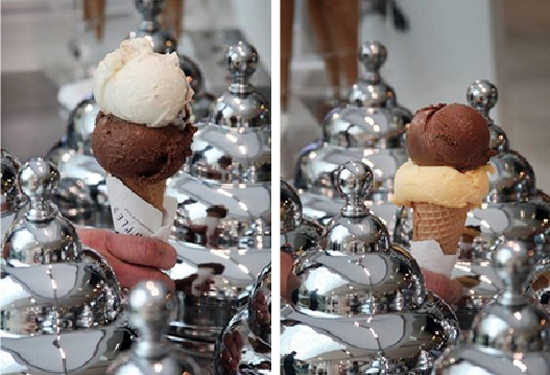
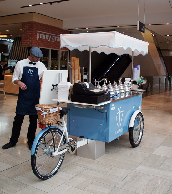
Since posting the PODfind on 7 Apples Gelato last week, the team has been in touch to say that their gorgeous gelato cart is not a pop-up.  The super slick three wheeler was made in Italy (I should have known!) for the Emporium location and they are parking it there permanently.  Yay, I say, to that news!

You can find the cart in the upper level food court, Emporium, 287 Lonsdale Street Melbourne, and keep up to date with the latest flavours and gelato goodness via facebook.com/7apples-Gelato-Emporium or instagram.com/7applesgelato

#PODfinds

Sweet As … Craig & Karl

DCIM202GOPRODCIM202GOPRODCIM202GOPRODCIM202GOPRO

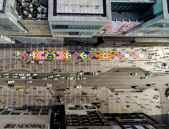
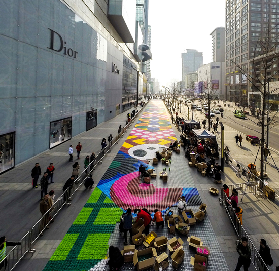
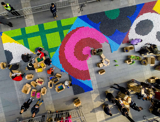
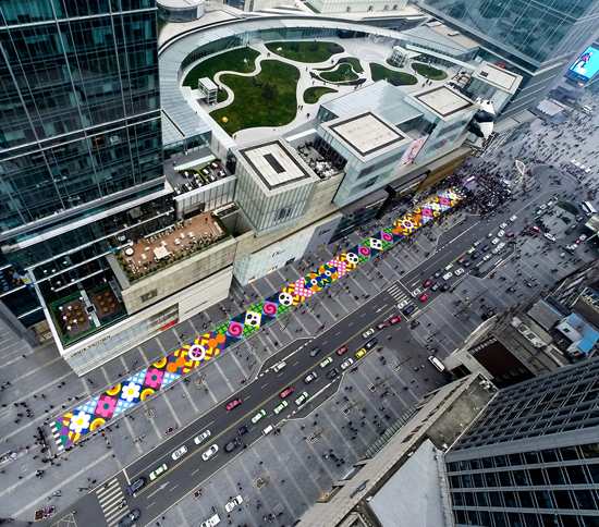
Ooh love this dramatic street art by a couple of my fave designers, Craig & Karl. Installed earlier this year in Chengdu, China, it is made from 13 tonnes  of colourful wrapped candy (hope they don't have Ants in Chengdu!) and installed by volunteers to Craig & Karl's design specifications. The piece measures 14,000 square feet (1300 m2) and stretches 607 feet long. (185m long) and really pops amid all that concrete and lack of colour in the surrounding architecture.

Images and technical deets  via facebook.com/Craig-Karl and knstrct.com

Craig & Karl VM China
13/04/2015

Permanent Parking

truckdeluxetelaviv1 truckdeluxetelaviv8truckdeluxetelaviv4truckdeluxetelaviv3truckdeluxetelaviv7truckdeluxetelaviv6truckdeluxetelaviv5

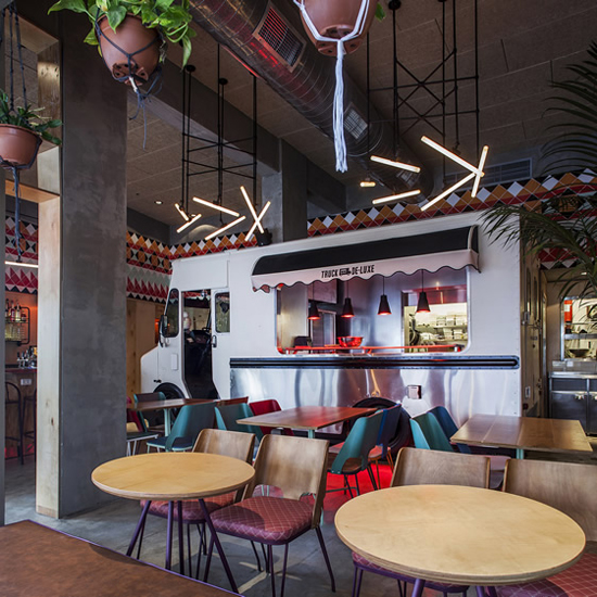
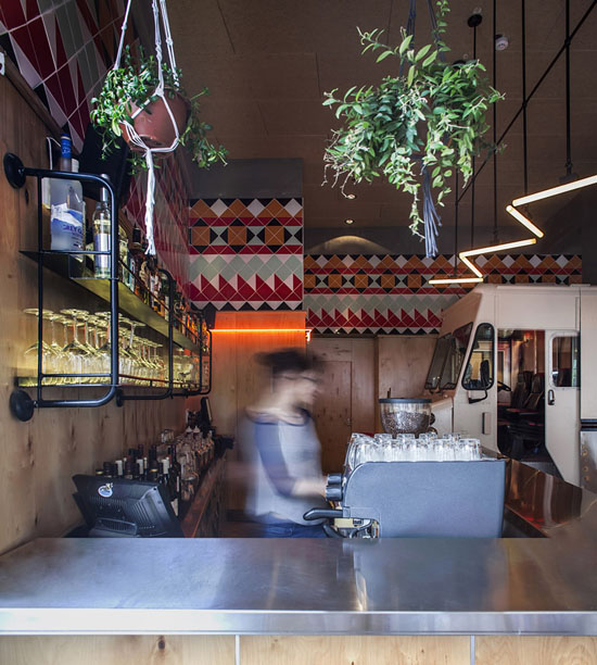
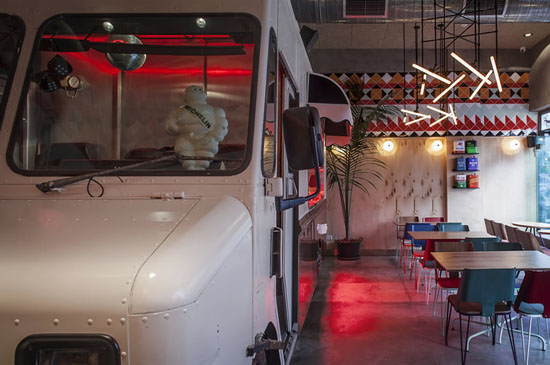
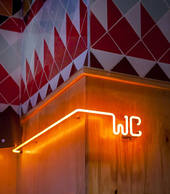
Truck Deluxe has given up life on the road and set up shop in a new bricks-and-mortar premises in the Jaffa neighbourhood of Tel Aviv. The truck has been pulled apart and reconstructed as part of the kitchen with the added bonus of proper chairs and tables. In addition, the shopfront opens up street completely for a bit of extra atmosphere from the surrounding flea market. Studio OPA designed the space, imagining the venue as a backyard garage. Cans of motor oil adorn the walls, and industrial materials such as stainless steel and humble wood panelling are also in evidence. An injection of colour comes via a tile pattern arrangement running around the top of the dining area. This is a ceramic tribute inspired by the home of Truck Deluxe’s Southern USA barbecue style menu.

Words & pictures via WeHeartUK.

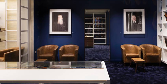
Cheaney’s Craft is Well Composed

pod_cheany_london1pod_cheany_london2pod_cheany_london3pod_cheany_london6pod_cheany_london7pod_cheany_london4

London’s Jermyn Street is known for many things, but most of all for being home to some of the finest tailors, shirtmakers and leather goods suppliers since the 17th century.

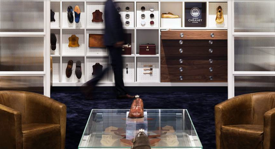
Cheaney’s shoes are a rare thing; wholly made in England from start to finish. It’s a traditional manufacturing industry of which there are very few left, and many of its team of 140 craftspeople have long held family connections with the business. But while so many heritage brands play on the old-world feel of craftsmanship and dusty Dickensian workshops, Cheaney enlisted contemporary design consultants Checkland & Kindleysides to take a more honest approach in their concept for the store.

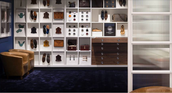
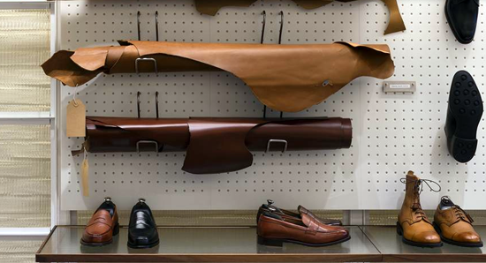
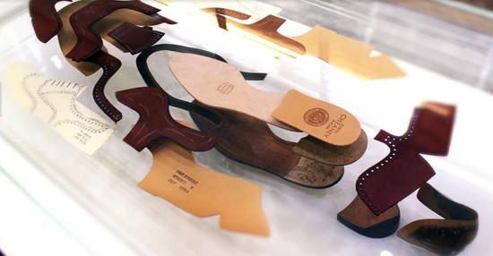
The interior doesn’t romanticise the shoemaking process with fake nostalgia, instead it mimics the real-life factory of today. From the corian pegboard to the 1:100 scale model of the factory, the entire store is an exploded and layered display of how Cheaney & Sons make their shoes in a true-to-life, polished up, modern and contemporary setting. The design of the new store feels fresh and energising. It tells a fascinating story of how the shoes are made without being patronising. The intelligent (never gimmicky) use of materials and a lightness of touch in the design speaks to a more youthful, maverick clientele without alienating Cheaney’s traditional and longstanding customers.

When Cheaney approached the designers, they talked proudly about the company’s history. “But more than this, it was evident that the shoes and boots they make have a broad appeal across all age groups and tastes, appealing to people who love quality and craft but also individual expression and enduring style,” says Checkland Kindleysides co-founder Jeff Kindleysides.

“We felt we needed to create a store that departed from the perception of handmade English shoes being trapped in a place that was heritage, tradition and bygone, expressed in shops of dark wood and brown leather. We thought that for Cheaney to stand out in Jermyn Street our design should be light and be centred on the message of 'Made in England'. This for us is where the premium lies. This is why we built a store that says 'we still make our shoes in our factory in Northamptonshire'.”

The store is divided into two distinct areas. The front half – with its white painted brickwork, panelled ceiling and metal framed screens with reeded glass – echoes the factory itself. The rear is designed to feel like the boardroom area, with portraits of the founders Joseph Cheaney and his son Arthur removed from their gilded frames and hung in Perspex boxes, for a touch of Tate Modern cool.

This is where customers are served and fitted with their shoes, and the back wall provides additional displays of shoes and tools, leather sample finishes and details. Next to this, Joseph Cheaney’s most premium range of shoes is presented in a glazed cabinet behind locked sliding walnut-framed doors.

Describing the wall of old wooden shoe lasts right at the back of the store, Kindleysides says they wanted to celebrate this iconic symbol of the shoe maker's trade. “It immediately strips the story back to the starting point. From the outset we wanted to feature the lasts, each pair is an original from Cheaney's archive and each has a story to tell. They're all date stamped and they say a lot about the company's lineage as do the portraits of the company's founders.”

They say that to really know someone you have to walk a mile in their shoes. Checkland Kindelysides have done that for us with Joseph Cheaney & Sons, but their efforts are so successful they’ve created a store that makes you want to do the journey for yourself.

Words and pictures via The Telegraph, UK.  Author, Henrietta Thompson.

Article reference: telegraph.co.uk/luxury/design/43301/cheaney-sons-reinvent-tradition

Cheaney & Sons, 21b Jermyn Street, London, SW1Y 6HP  cheaney.co.uk
Best Foot Forward for this First Flagship

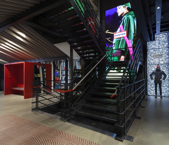
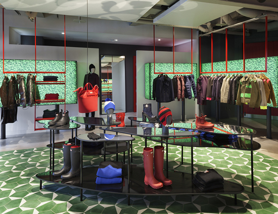
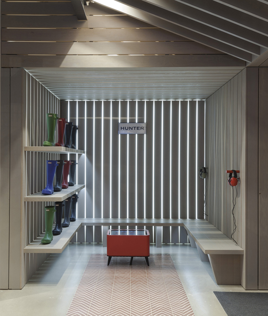
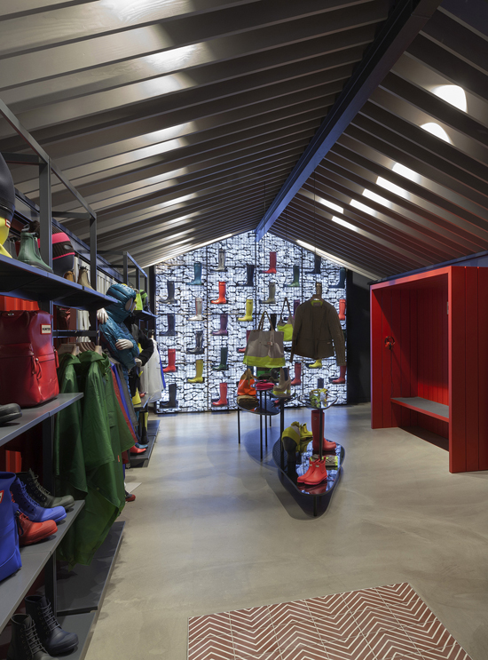
Checkland+Kidleysides+Design+Hunter's+First+Global+Flagship+Store-3Hunter-flagship-store-by-Checkland-Kindleysides-London-UKCheckland+Kidleysides+Design+Hunter's+First+Global+Flagship+StoreCheckland+Kidleysides+Design+Hunter's+First+Global+Flagship+Store-5Checkland+Kidleysides+Design+Hunter's+First+Global+Flagship+Store-1Checkland+Kidleysides+Design+Hunter's+First+Global+Flagship+Store-2Checkland+Kidleysides+Design+Hunter's+First+Global+Flagship+Store-4

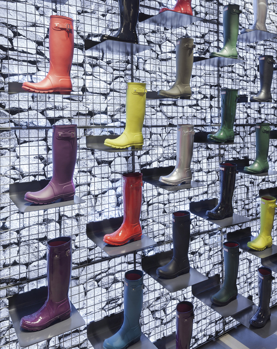
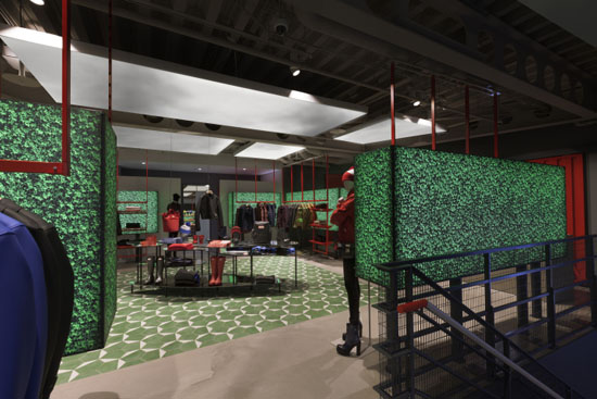
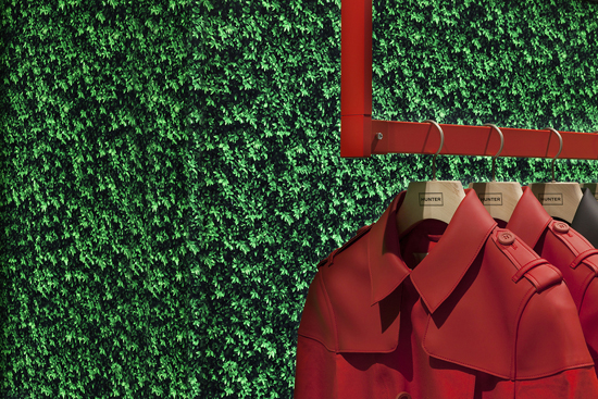
The iconic British gumboot brand, Hunter, has unveiled an impressive new flagship store on London's Regent Street. I really want to jump on a plane and buy a new pair of Wellingtons after perusing these pictures and that red rubber shoulder bag is definitely going on my London Lust List!

Designed by Checkland & Kindleyside, they described the store as 'a journey designed to capture the senses and a spirit of adventure, it’s a playful and very Hunter take on the outdoors. It’s surreal, graphic and at times dreamlike, it’s a fantasy take on reality executed in a uniquely Hunter way. The innovative design takes iconic references from the British countryside and reappropriates them for the urban setting. The store creates a new take on rural architecture and the outdoors, redefined in the spirit of Hunter. Spanning three floors, the store provides the opportunity to create three distinct experiences for visitors; each one reflecting Hunter's pioneering spirit as a brand that 'takes the path that others dare not take'.  

From Hunter's Creative Director ..."The Regent Street flagship is the first opportunity for the Hunter customer to enter the home of this iconic British brand. This ambitious new store concept starts to clearly deliver a retail experience that represents the brand’s exciting new vision and future. It was important to establish our first retail presence on London’s Regent Street, one of the most iconic shopping streets in the world, staying true to our heritage as a British brand."  

Photos and words via checklandkindleysides.com

hunterboots.com  #hunterregentstreet

Hunter Fashion London
12/04/2015