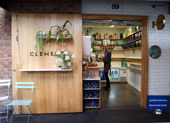
Sometimes in life you just need closure. This door does it for me. You can find Clement Coffee Roasters at South Melbourne Market where they peddle good caffeine and donuts just a few doors up from those famous dim sims. #PODfinds

Sometimes in life you just need closure. This door does it for me. You can find Clement Coffee Roasters at South Melbourne Market where they peddle good caffeine and donuts just a few doors up from those famous dim sims. #PODfinds

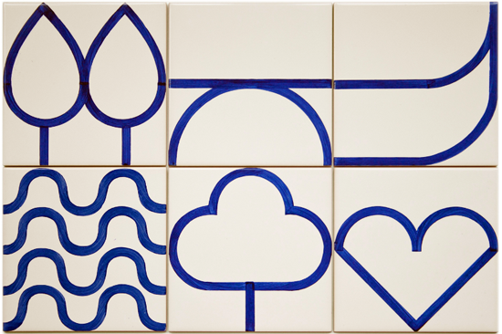
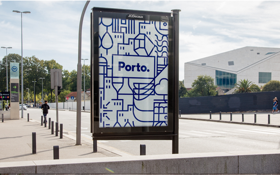
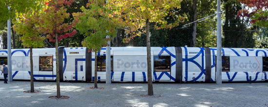


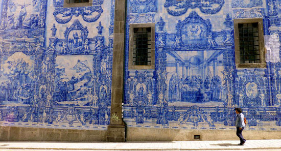
Porto is a coastal city in northwest Portugal known for its soaring bridges, Port wine and decorative blue and white tiles that have been a feature of the city's architecture for centuries. In the medieval Ribeira district, narrow cobbled streets wind past merchants’ houses and cafes, medieval relics, majestic bell towers, extravagant baroque churches and stately beaux-arts buildings.
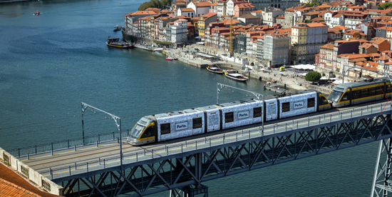
Over the past decade or so Porto has undergone a remarkable renaissance with a new and efficient metro system and notable architectural additions including Rem Koolhaas’ Casa da Música. A popular long weekend getaway for Europeans in search of the sun, the city's graphic identity is a reflection of the increasingly cosmopolitan lifestyle offered by this ancient city.
The words below are from www.atissuejournal.com:
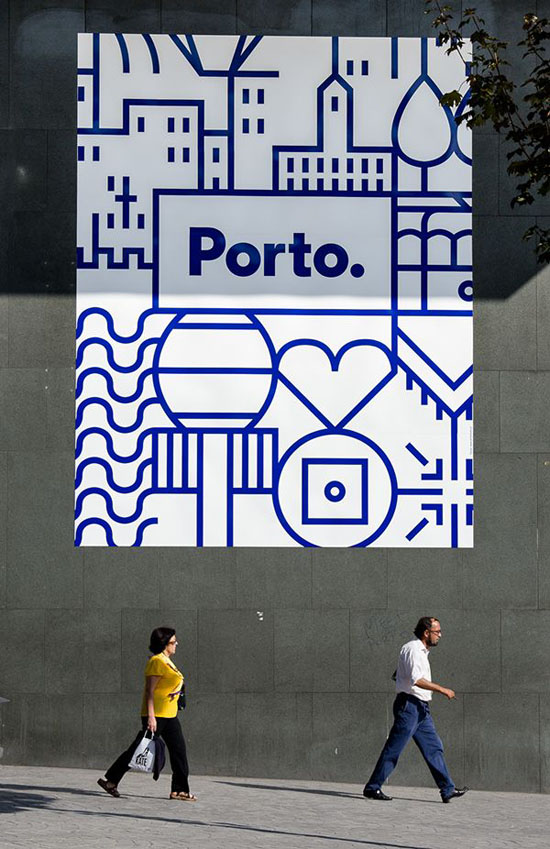
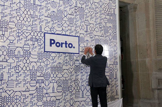
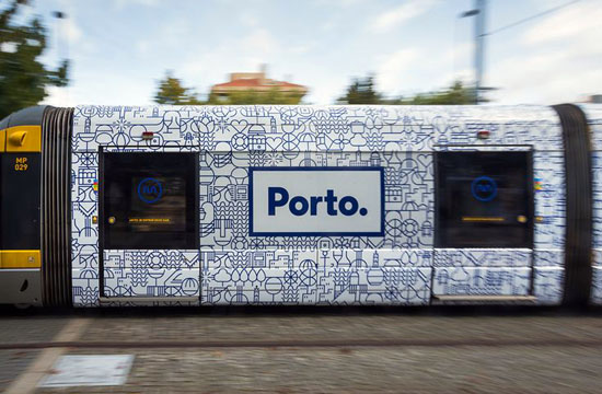
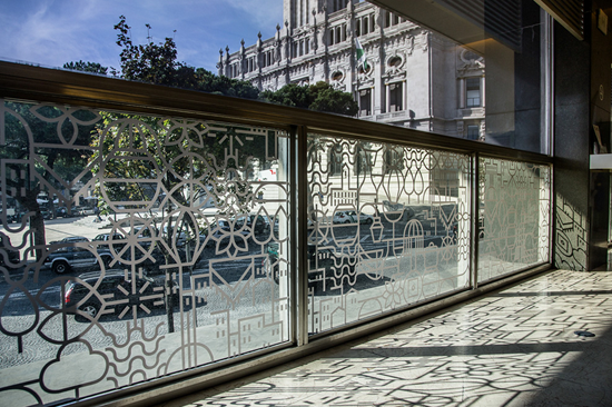
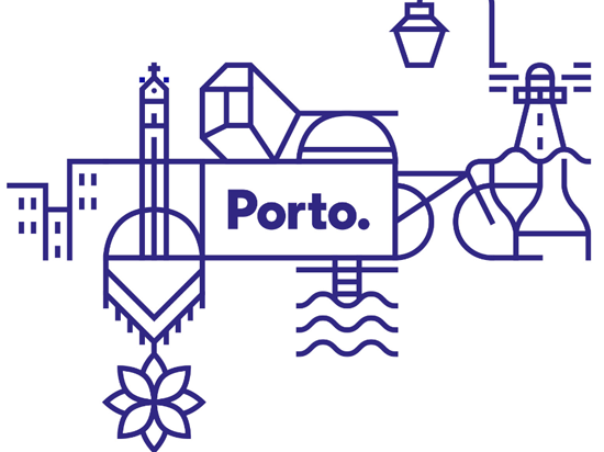
"When it came to designing a graphic identity for the city of Porto in Portugal, one visual symbol wasn’t enough. Porto-based design firm, White Studio, brainstormed what made Porto memorable and unique, and asked people on the street how they viewed the city. No two answers were alike. White Studio concluded, “We felt we needed to give each citizen their own Porto. We needed to show all of the cities that exist in this one territory….It became clear to us that Porto needed to be much more than a single icon, much more than a single logo. It needed complexity. It needed life. It needed stories. It needed personality.”
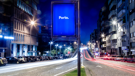
The designers also needed a way to create a single unified look that would serve as Porto’s one graphic identity. The answer came in the decorative blue ceramic tiles seen throughout the city for centuries. The line drawings and illustrations on the tiles depicted visual stories about Porto’s history, landmarks, and natural surroundings. That inspired White Studio to create 70 pictograms that represented Porto and its people. The pictograms were designed to fit on a grid that could be combined into a network of images or used individually. The logotype itself is a simple blue sans serif against a white background within a blue boxed border. The beauty of this visual system is that it allows elements to be changed out frequently and still be recognizable as Porto’s graphic identity. It works."
Images via www.underconsideration.com and White Studio, Rua Alexandre Braga 94, 1ºEsq. 4000-049 Porto, Portugal
#PODfinds

I have no idea where in the world this 'concrete and clock' installation is located. Spotted on Flickr, I liked it enough to share it with you.
via www.flickr.com/photos/eam
#PODfinds
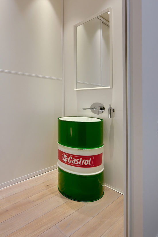
To March to the Beat of a Different Drum mean to do things in one's own way regardless of societal norms and conventional expectations. This bathroom does that rather well.
Image via www.homedit.com
#PODfinds
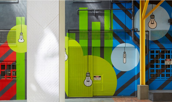
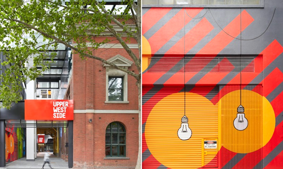
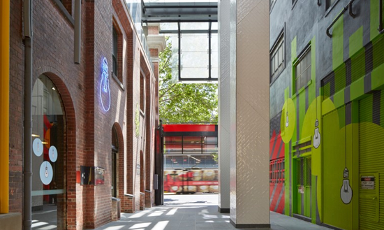
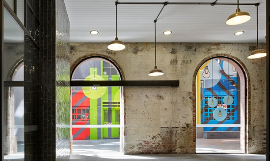
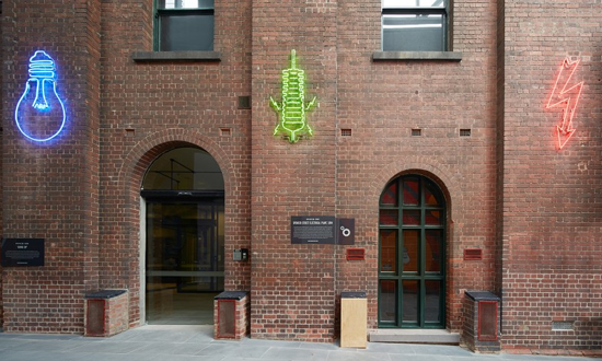
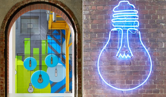

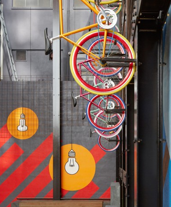
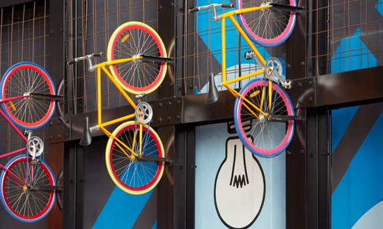
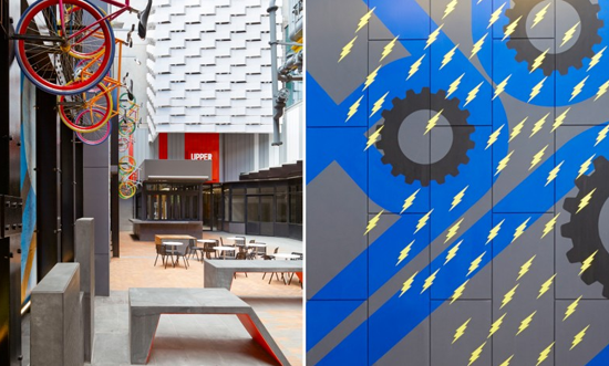
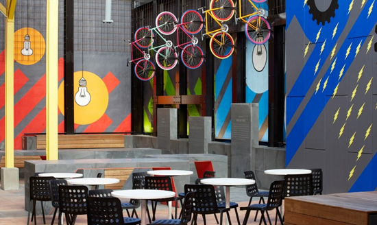
High rise apartment blocks continue to sprout all over Melbourne's city scape. Some developers do them well, others not.
POD is a long time fan of the work of Mim Design and their Upper West Side project is no exception. Working with Latitude and Diadem on design and delivery, this playful communication celebrates the sites old power station heritage and appeals the youthful lifestyle that now lives within.
Images via www.mimdesign.com.au
www.diadem.com.au and www.latitudegroup.com.au
#PODfinds
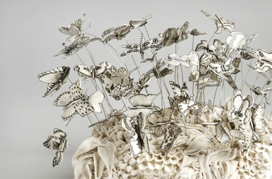


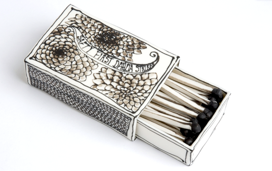
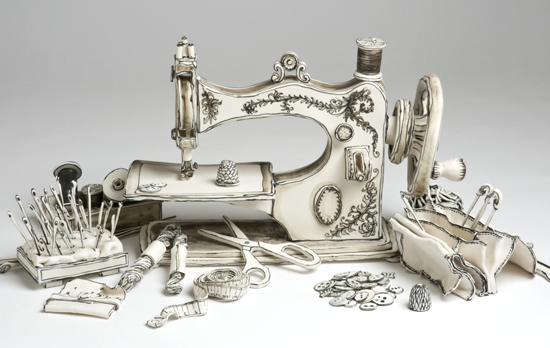
Katharine Morling is a UK ceramicist, and a rather fabulous one at that! The images above are of her exquisite sculptures of familiar objects from times now past. Formed from milky white porcelain, the monochromatic hand drawn detail is fired without glaze to accentuate the 'drawn' quality and detail of the work.
The artist herself says of her craft ... "I see my work as 3 dimensional drawings. Each piece, on the surface, an inanimate object, has been given layers of emotion and embedded with stories, which are open for interpretation in the viewer’s mind. When put together, the pieces combine to make a tableau staging the still lives of everyday objects. The life size pieces and the unexpectedness of the scale create a slightly surreal experience."
Via www.katharinemorling.co.uk
#PODfinds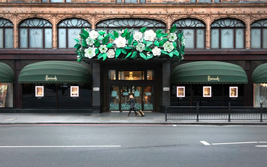
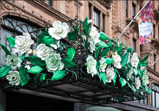
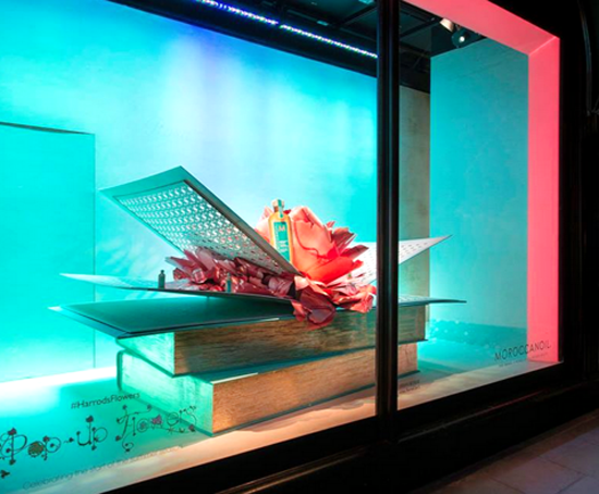
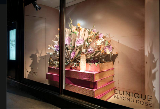
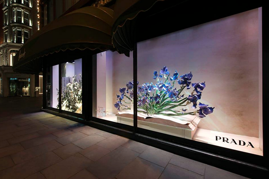
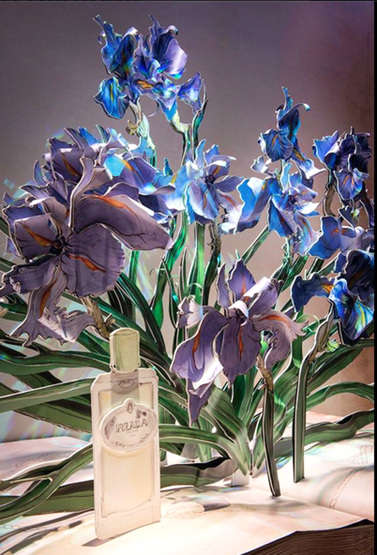
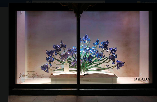
The smell of Spring is wafting through Harrods. White peonies adorn the entrances to striking window displays that celebrate the scents of Prada to Escada. As a rather fitting brand association for this visual feast of all things perfumed and floral, Harrods will unveil their inaugural ‘Fragrance Garden’ at the Chelsea Flower Show which opens 19 May 2015.
Images via www.harrods.com #PopUpFlowers
#PODfinds


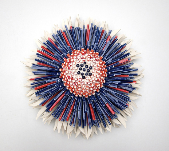
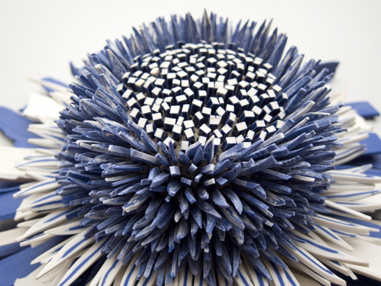
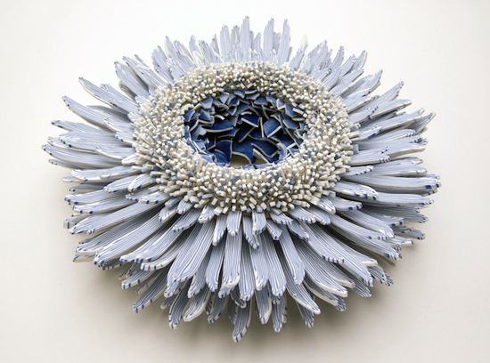
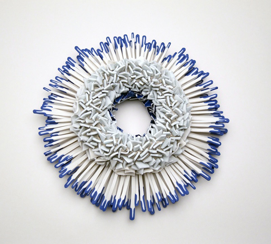
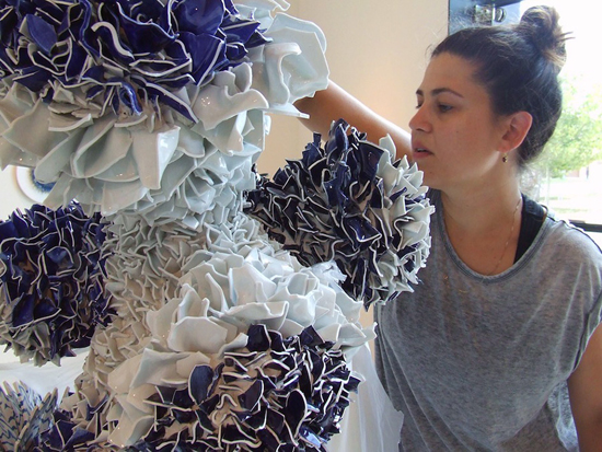
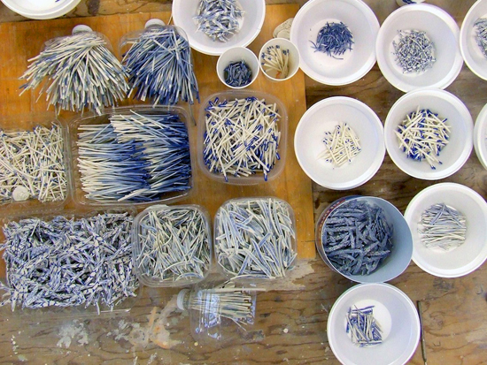
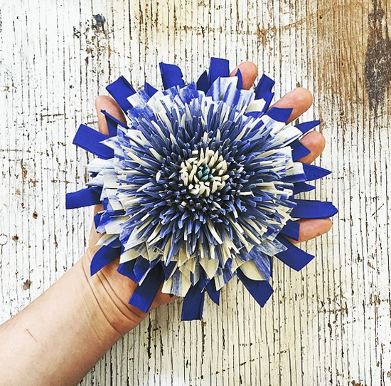
Ooh I wish I was in London this week for the inaugural London Craft Week. A brand new, week-long, festival of activities and exhibitions to celebrate all sorts of craftsmanship across the capital. Galleries and artisan workshops in central locations such as Bloomsbury and Mayfair, which have been hubs of industry and craftsmanship for many centuries, are hosting events to showcase both ancient skills and exciting new talent.
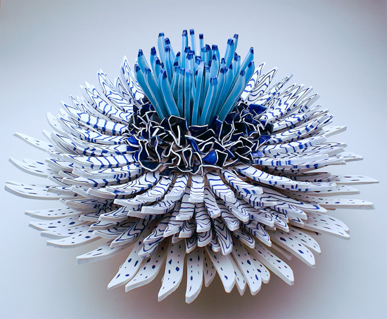
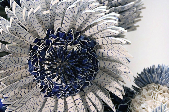
I am in awe of the beautiful work by Israeli artist, Zemer Peled. These stunning blooms are formed from ceramic shards. Her work is showing at the Saatchi Gallery for COLLECT 2015 (The International Art Fair for Contemporary Objects). If you live in London, get your skates on as it closes 11 May.
www.londoncraftweek.com
Images via www.zemerpeled.com
#PODfinds
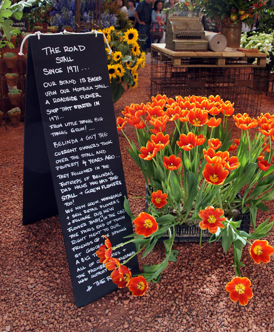
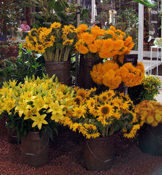
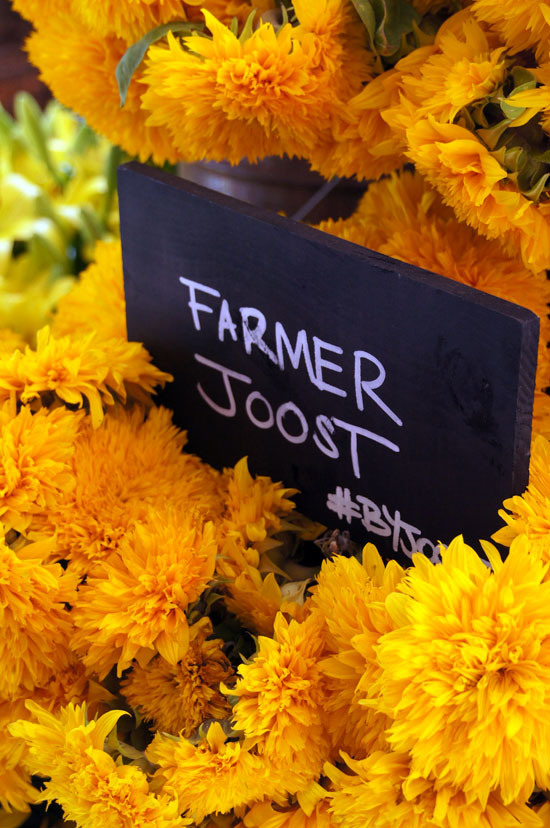
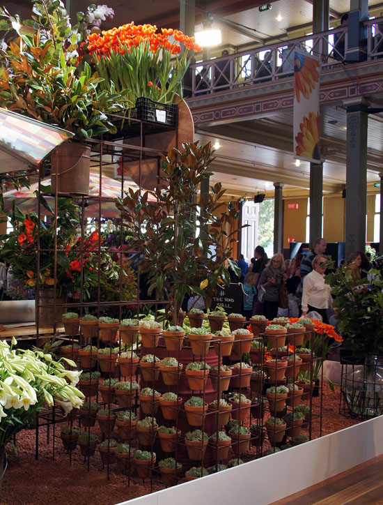
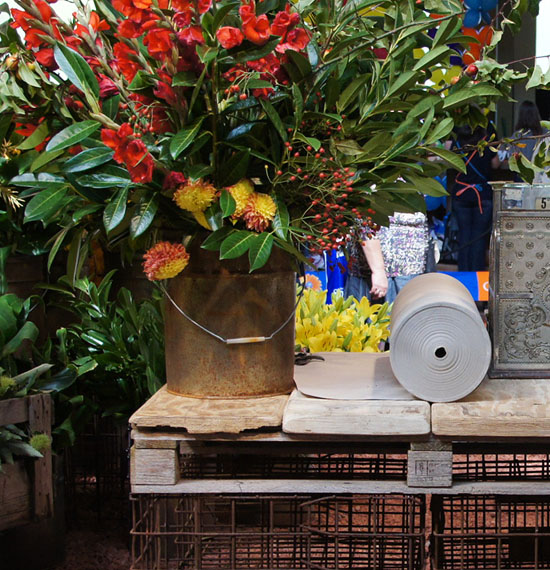
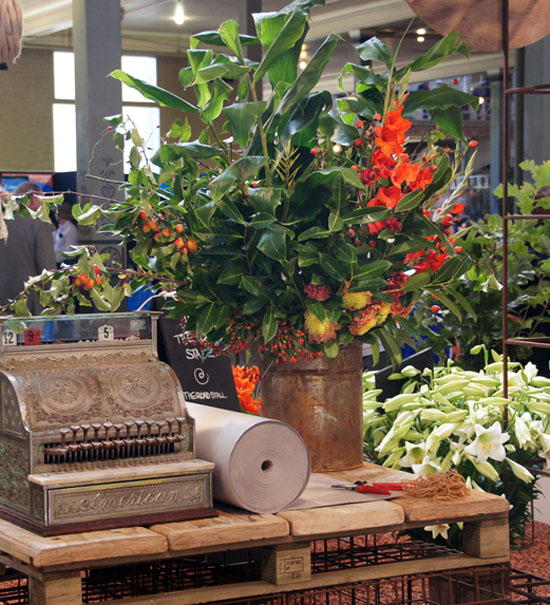
I seem to be obsessed with small sheds and roadside stalls this week. Melbourne's The Roadside Stall florist was my pick for best in show at the MIFGS last month. Rustic, reclaimed props, terracotta pots of succulents and big rolls of natural twine & brown paper supported a stunning show of sunflowers, tulips, lillies and chrysanthemum. Loved the gravel by Eco Group which is made from 100% recycled bricks. #byjoost
You can find the stall in Monbulk or Spring Street or discover more on facebook.com/theroadstall or twitter.com/ecogroup1
#PODfinds
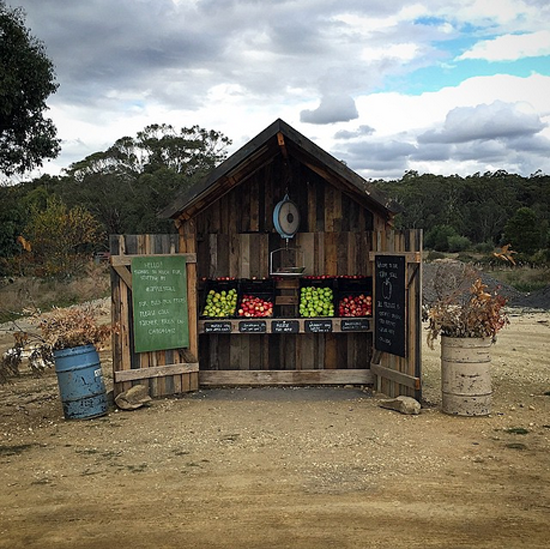 Daylesford Organics (not to be confused with the posh 'all white and oak' London noshery) is a farm north of Melbourne. Certified organic, they focus on sustainability and biodiversity and produce up to 40 varieties of apples a season, hazelnuts, berries, free range eggs and vegetables. Heirloom varieties with lots of different flavours and colours are a speciality. Selling their quality produce to local cafés, restaurants and through farmer's markets, you can also collect a just picked apple via their super cute roadside stall.
#PODfinds