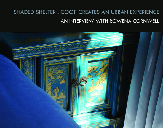
Late last year I sat down to chat with Rowena Cornwell about her approach to interior design, and to find out more about the Balfour Hotel for which her firm, COOP Creative, had just won Best Hotel Under 50 Rooms, the only Australian hotel to be recognised at The International Hotel & Property Awards in London.
The Balfour is part of the Spicers Group and is essentially a nine room ‘home away from home’, albeit a quite luxurious one, located in New Farm, inner Brisbane.
Whilst small in scale, the Balfour is a big experience, one that is both quintessentially “Queensland at heart” but also exudes a casual European elegance. It was not quite what I expected and, for me, personally very satisfying to discover.
Cited as one of COOP’s favourite projects to date, Rowena says she loved the challenge of transforming a classic wooden Queenslander built in the 1920’s into a modern yet sympathic space. Fundamentally, Cornwell says, the project was about domestic scale architecture with a commercial use.
POD: How would you describe your design approach in one sentence?
RC: I’m always looking for the beauty, or potential beauty, in a space.
POD: From what I have seen of your work, I would describe it as considered, classic and contemporary. It appears to me you create relevant spaces that feel both special yet immediately familar and informal. The Balfour speaks volumes about the calibre of both your approach and of course your client. Did she give you a fair amount of freedom here?
RC: She is an international business woman who has travelled extensively for both business and leisure. She was clear about all the things she felt were important to a boutique hotel experience. We had worked together on other projects in the past so she was confident we could deliver what were essentially pretty small rooms and spaces and still meet the 'experience' expectations she had for her future guests.
POD: Prior to the hotel, the residence was a boarding house then a back packers. Those words conjure up images of a rabbit warren to me! What condition was the building in, and how much of a challenge was it to see the potential beauty?
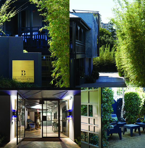
RC: A rabbit warren indeed, and a filthy one at that! It was covered in years of grime and uncaring, but the house had great bones. Our challenge was to create nine guest rooms, a lounge and dining space, a reception area and small conference facility within a fairly small footprint, as well as car parking including DA access, and an entry statement worthy of the hotel’s positioning.
POD: The entry is to the side and well down the driveway, a conventional approach would have been to put it at the front of the building?
RC: We wanted to create a real sense of arrival. The drive is fundamentally a leafy lined lane way that brings you down to the heart of the hotel. Guests are ‘greeted' by a doorman sculpted by a local artist, “he’s the person in the room if you like”. Reception is directly upstairs, which is the anchor between the lounge and the dining space. The guest rooms are delineated by a corridor, providing a sense of separation from the public spaces. The lighting and darker palette in the corridor helps create this separation and a sense of drama before entering the bedrooms.
POD: What was your biggest challenge with this project?
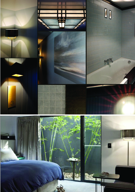
RC: Fire rating! New legislation introduced in Queensland after the Childers Backpackers fire put more demands on a finite budget. It is a timber home, we could not go any higher than 2 levels and there were lots of challenges with marrying the existing building and a new structure, complying to building codes and achieving a beautiful resolution of the space. In addition to this we also had south facing bedrooms, so getting natural light into rooms was a key consideration throughout the design process.
POD: I read recently where Megan Quinn, the founder of Net-A-Porter (and another successful Brisbane girl to boot!) imagined a 1950’s bell boy carrying parcels and boxes for a stylish woman as the inspiration behind her packaging which proved to be a huge part of Net-A-Porter’s success story. What were your first thoughts when imagining the possibilities for the Balfour? Was there a single image that summed up your vision or started the creative process for this project?

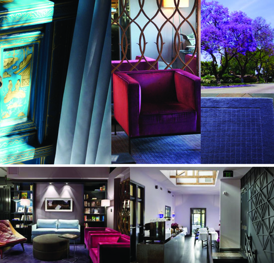
RC: Before studying Architecture, my first degree was in fashion design. Fashion is a natural starting point in my design process. I’m also quite good at day dreaming about the possibilities ... who might use the space, what sort of lives they lead, how they might feel when staying in a space I have created ... for the Balfour my starting point was a beautiful PRADA advertisement. At the time the image just crystalised my thoughts about colour and style, and all the possibilities ahead. The beautiful jewel palette inspired the soft furnishings and the soft blue / grey finishes.
POD: The result is an interior that is soothing and cool without being cold. The subdued lighting and slivers of natural light offer a subtle respite from the Queensland sun (summers can be brutal in this part of the world). The rich velvets and palette remind me of some of the modern hotels I have visited in Milan. The more I think about the hotel, it has a rather contemporary Milanese feel about it. How do you view the hotel now that it is completed?
RC: The spaces have been 'lived in' for a little while now and these days I tend to think of the hotel as rather like staying at a rich Uncles' house. It is a place you know you are going to enjoy and have a bit of a special experience, one where you are keen to pack your bag and go, and feel a little sad that you actually have to leave. It's a personal experience and a pleasure to stay there.
POD: Your work is an inspiration. Congratulations again on your Award and thank you for taking the time to share this story with POD readers.
COOP is a Brisbane based design practice. To see more recent projects in retail (Westfield Carindale), residential and commercial go to www.coopcreative.com.au


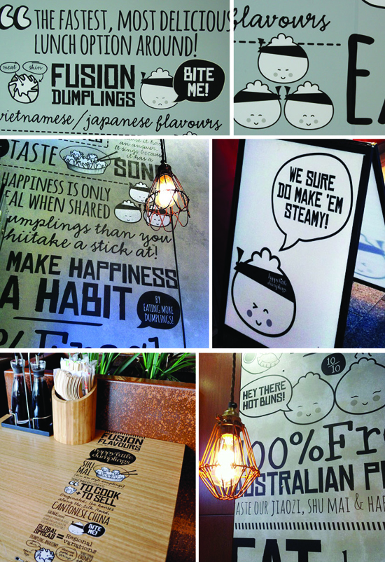 Loving the happy little graphics done by Tandem E Tandem for Happy Little Dumplings. You can find HLD in happy little locations around inner Brisbane.
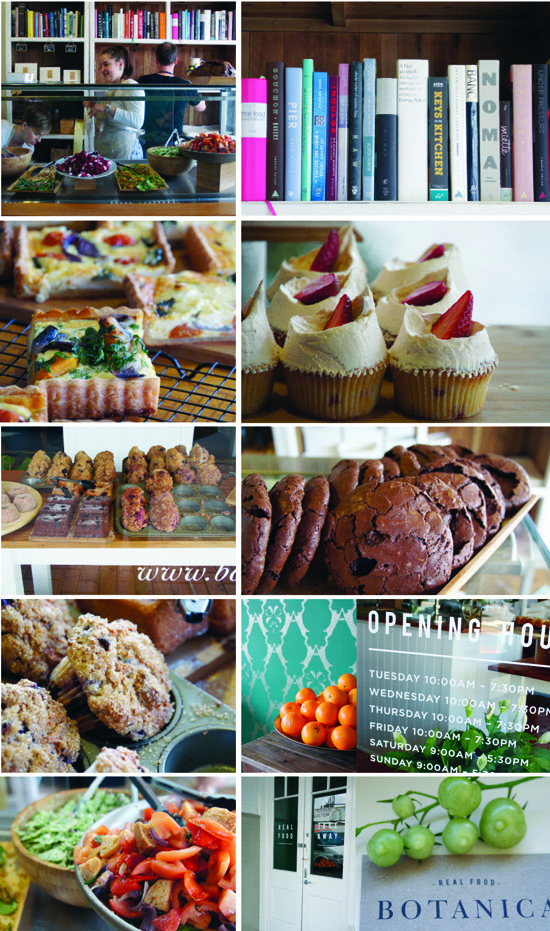 Botanica seems to operate on the philosophy "less is more". It is a tiny shop offering a small range of super fresh salads, savoury tarts and gluten free goodies for sweet tooths. No seating or espresso machine, this is all about good food to go. Gorgeous packaging and a steady stream of customers makes me suspect Brett and Alison Hutley have a hit on their hands. Head to 1 Enoggera Terrace Red Hill (Brisbane) - the gluten and diary free big chewy chocky biscuits are worth the trip alone! Botanica is right next door to Bowerbird Collections (see post below). www.botanicarealfood.com.au
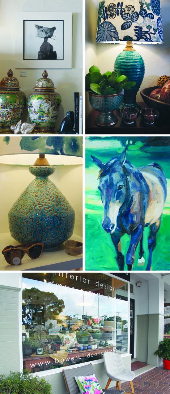 At first glance Bowerbird looks like another 'lovely' interiors store. I quickly discovered the mother and daughter talent behind the counter makes this little nest of stylish things for the home a stand out. Peta Sweatman is a ceramicist who hand makes the bespoke lamp bases that are a feature item. Shades in all sorts of designer fabrics add the finishing touch. With most things made (and made well) in China these days it is refreshing to find someone bucking the trend. The pony painting is hues of blue also caught my eye. Turns out Peta's daughter is the artist. She will take a portrait or photo of a favourite pet and turn it into a work of art with her paint brush and acrylics. Affordably priced, her work would make a great anniversary or special occasion gift. You can find Bowerbird Collections at 1 Enoggera Terrace, Red Hill, Brisbane. Ph (07) 3368 3241. www.bowerbirdcollections.com
  Shibori is the ancient Japanese art form of dyeing cloth. I have just discovered my neighbour has a serious talent for the craft, and from what I can see it's a messy process. She tells me there is a precise formulae to mixing a 'really good' indigo vat and that it has taken her years to perfect the recipe. I popped over this afternoon and found her mid-way through creating another batch of artisan fabric. I took a few snaps of the string, gloves and PVC pipe that she uses in her dyeing techniques and was happy with the abstract results (hence this blog post!). She has no web site or established retail channel but I think she should. If nothing else I think the first few photos would make a fabulous large scale piece of photographic art in a Byron Bay beach house. Ah the talent hiding in the suburbs ... it needs to be encouraged and supported. "Indigo Jane" the world awaits your first exhibition!


 Andy & Dan are the lads behind Hawthorne Garage, a welcome newcomer to the deli / cafe / speciality food scene on Brisbane's south side, which is somewhat lacking from what I can see (and equals opportunity from where I sit and tap this out!).
 You can find this modern little grocer giving the south side a tune up in both the food and service stakes on the corner of Orchard Street & Hawthorne Road, Hawthorne. Big thanks to the lads for letting me take some snaps, I am sure they will do very well here with their first venture. Open 6am to 8pm daily. Hawthorne Garage, 255 Hawthorne Rd, Hawthorne QLD.
 Now in it's third year, Southbank's Regional Flavours was a big hit with Brisbanites this weekend. The v. talented team from Gloss Creative put together the experiential areas including a fabulous fluoro wheelbarrow garden where visitors could pick 'n mix their preferred herb combination to make a hot tea infusion (I am off to buy a lemon verbena plant for my garden after sniffing that stunning aroma). Screen printed burlap bunting transformed 2 big-top tents into eye catching event spaces, and they were obviously the 'place to be'. Specialists in all manner of foodie topics talked to full houses at each session from what my little eye spied. Southbank do a great job with community events and I'd have to say the sheer number of artisan producers who gathered in the gardens was pretty impressive.
 Regular readers have noted a distinct lack of blogging in recent months (thanks to those who emailed in to enquire if I was still upright!). POD has been super busy working with the Westfield Carindale design team on the development and delivery of a brand new casual dining precinct that includes Grill'd, Guzman Y Gomez, Wagamama, Ginga, good coffee from Veneziano, a totally new look Toscani's, Yum Cha, a Belgian chocolate shop and more (the locals are loving it!). Four days after this new precinct opened, the Wintergarden redevelopment in Brisbane's CBD also opened (lots of VM pics below on that one), and with no more than about 40 winks of sleep I found myself lending a VM hand at Westfield Fountain Gate (Melbourne) over the past few weeks. Given the very long list of 'boxes ticked' over the past few months you won't be surprised to know it took a very strong flat white to get fired up today and file these stories!