
How fabulous is the work of French studio zim & zou?! This wonderful window was created for the Hermès store in paseo de gracià, Barcelona.
The intricately folded and vibrantly colored paper and leather installation was made entirely by hand. The orange-and-blue-hued scene tells the story of a small fox who inhabits the space with his own personal objects, giving a glimpse into his quirks and personality. ‘the fox’s den’ is completed with furniture and household objects all made of paper, from the table and stool he sits on to the assemblage of photos hanging on the floral-patterned wall.
Hermès accessories such as ties, scarves and shoes are placed throughout the dwelling, uniting the fashion label’s wearable designs and the delicate and complex papercraft work.
Reposted with thanks from DesignBoom.


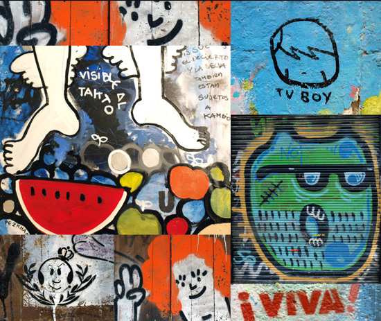
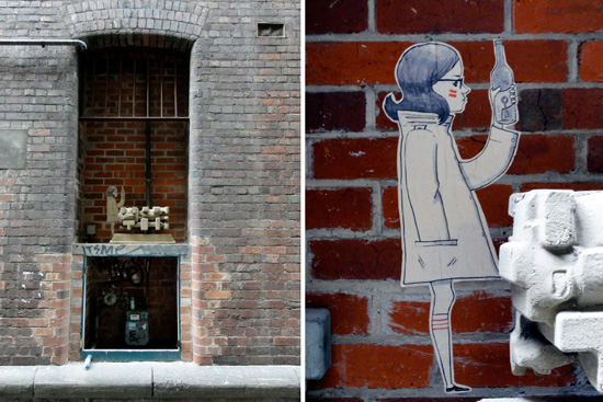 According to tonight's 6pm news a clueless cleaner has painted over a Banksy in one Melbourne's laneways. I guess if you're a cleaner and not a curator these things happen. The news story reminded me that I took lots of pics of graffiti art in Barcelona because it seemed to express the essence of this design driven, vibrant city. I also spotted this paper-cut girl hiding in an alcove in Niagra Lane (Melbourne) last week. Whilst it might be illegal to paint and post such work, it contributes to making our cities interesting, savvy and unexpected.
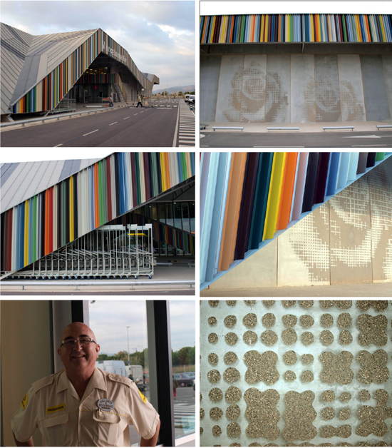 Willy Muller's colourful flower barn has received lots of design press. I went to Barcelona to see it for myself (as you do when you live half-a-world away). Loved the sandblasted rose detail on the loading docks as well as the use of colourbond. If you work at one of these 'buildings of interest' then you're quite used to reporters stopping by to smell the roses. My main man here, Jesus, wanted to know why no one ever took his picture (at least that's what I think he was saying in a hybrid Spanish/Italian 'make it up on the spot' dialog that didn't involve English). I promised him that he too would be published and I always keep my word. The big J also ordered me a taxi back to town for which I was most grateful given I was out in a paddock near somewhere close to nowhere.
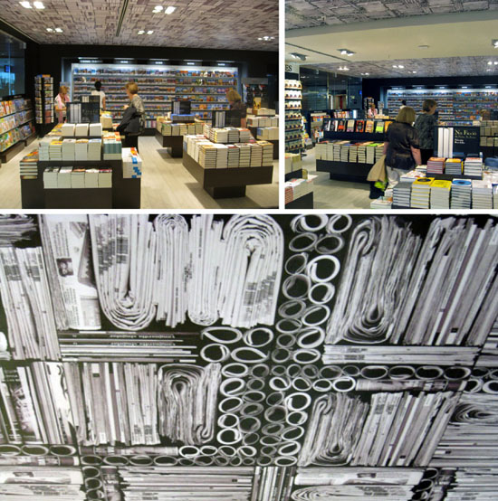 You really should study the fine print... the ceiling detail drew my eye into this book store/newsagency in Barcelona.
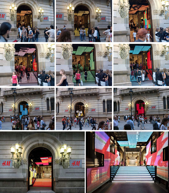
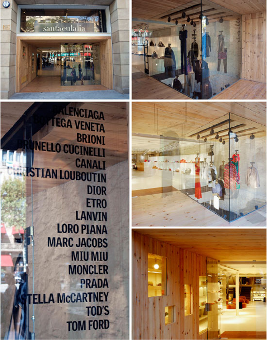 Loved the clean lines on this enticing entry designed to embrace the ups and downs of the industry.

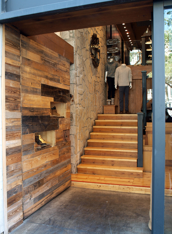 Door detail becomes display zone. Good thinkin' 99.
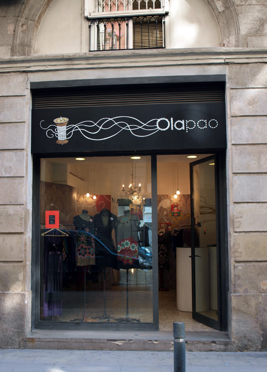
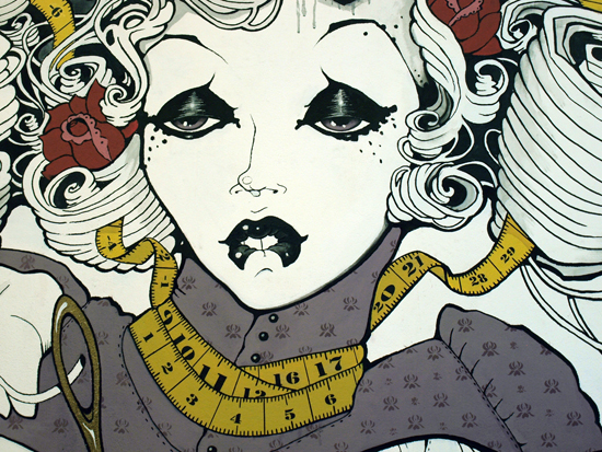
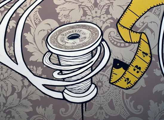
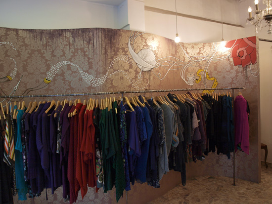 Teenie tiny Ola Pao is wow due to the layered wallpaper/graphic/collage combo.
 Great LED directional signage at Design Hub in Barcelona (now if an organisation like that can't get it right there's something very wrong going on).